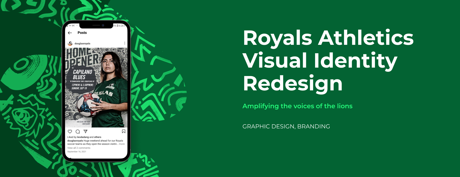
Royals Athletics Visual Identity
A redesigned visual that amplifies the bold and aspiring voice of the Royals athletics team.
A set of unique and adaptable visual assets were created with Understanding of the brand's history, culture, and vision.
- Team
- Sean Velasco, Sylvia Zhang (myself)
- My Role
- Illustrator, Graphic Designer
- Tools
- Illustrator, Photoshop, After Effects
- Duration
- 1 Month
Context
Royals is an athletics team from Douglas College with 20+ years of history. To stay relevant and maintain fan engagement, Royals planned to transform their look into a new one that gives fans fresh experience and allows fans to connect with the team in new ways.
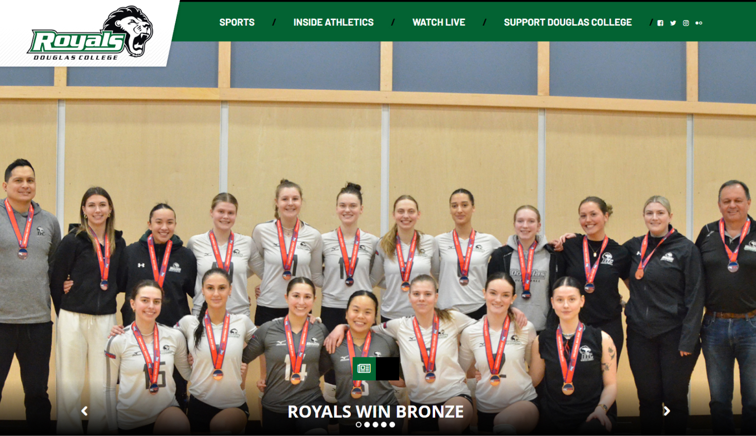
How might we innovate the visual representation of Royals to evoke new interests among its audience?
Discover
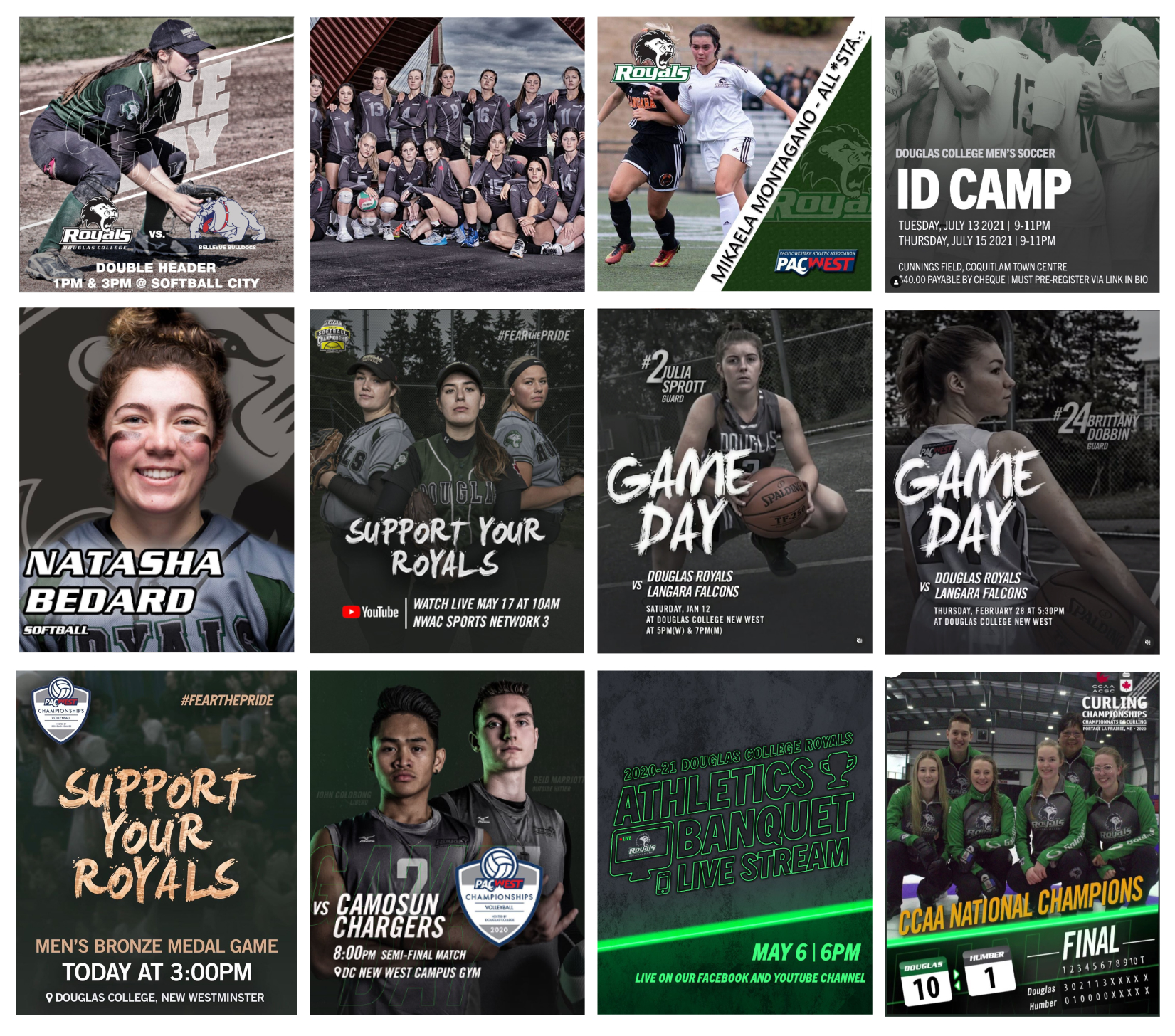
Review of past visuals
To better understand the potential of Royals as an athletics brand, I reviewed the visual and textual communication of the brand's past annual events and promotional materials. I found that the brand used to feature an urban presence with a cold and rough vibe, but in the last visual identity, they included a vibrant neon light as an element in most of their graphics. From discussions with Sean, the manager of the communication team, I learned that the brand would like to inject an energetic and lively vibe into its presence without becoming unrecognizable to its old fans.
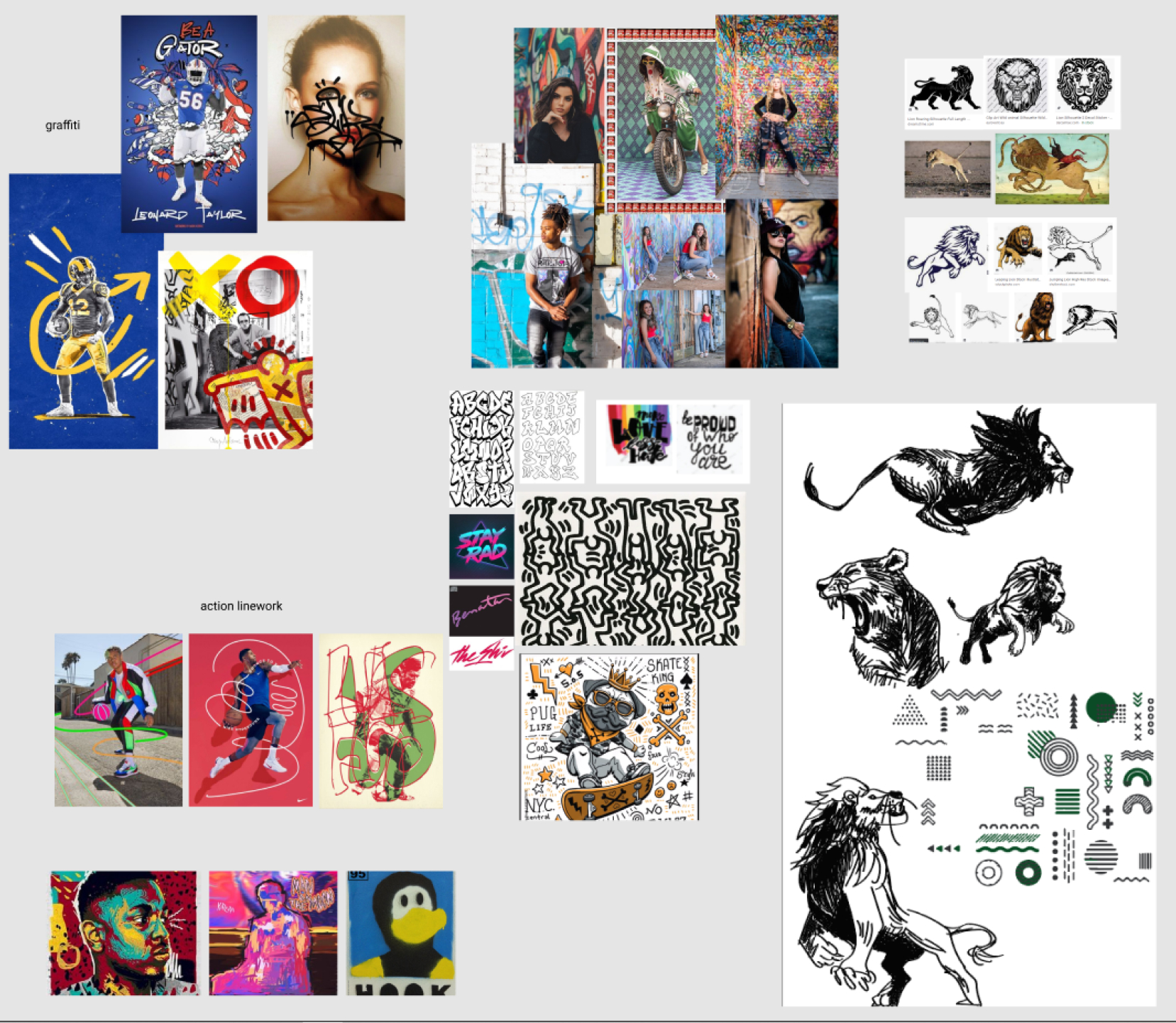
Exploration of new identity
Although I needed to stay consistent with Royals' past by keeping the brand colours and fonts the same, I was allowed to incorporate new image treatment, graphical elements, and typography into the new visual identity. Therefore, I created an initial image grouping to represent the potential visual qualities of Royals' new visual.
Define
Capturing Visual Qualities
I went through the image grouping with my supervisor, and narrowed down the art direction to 3 points:
- Iconic patterns made of simplified and symbolic forms.
- Dynamics introduced through angled placement of elements.
- Sense of urbanism created through the use of multiple textures.
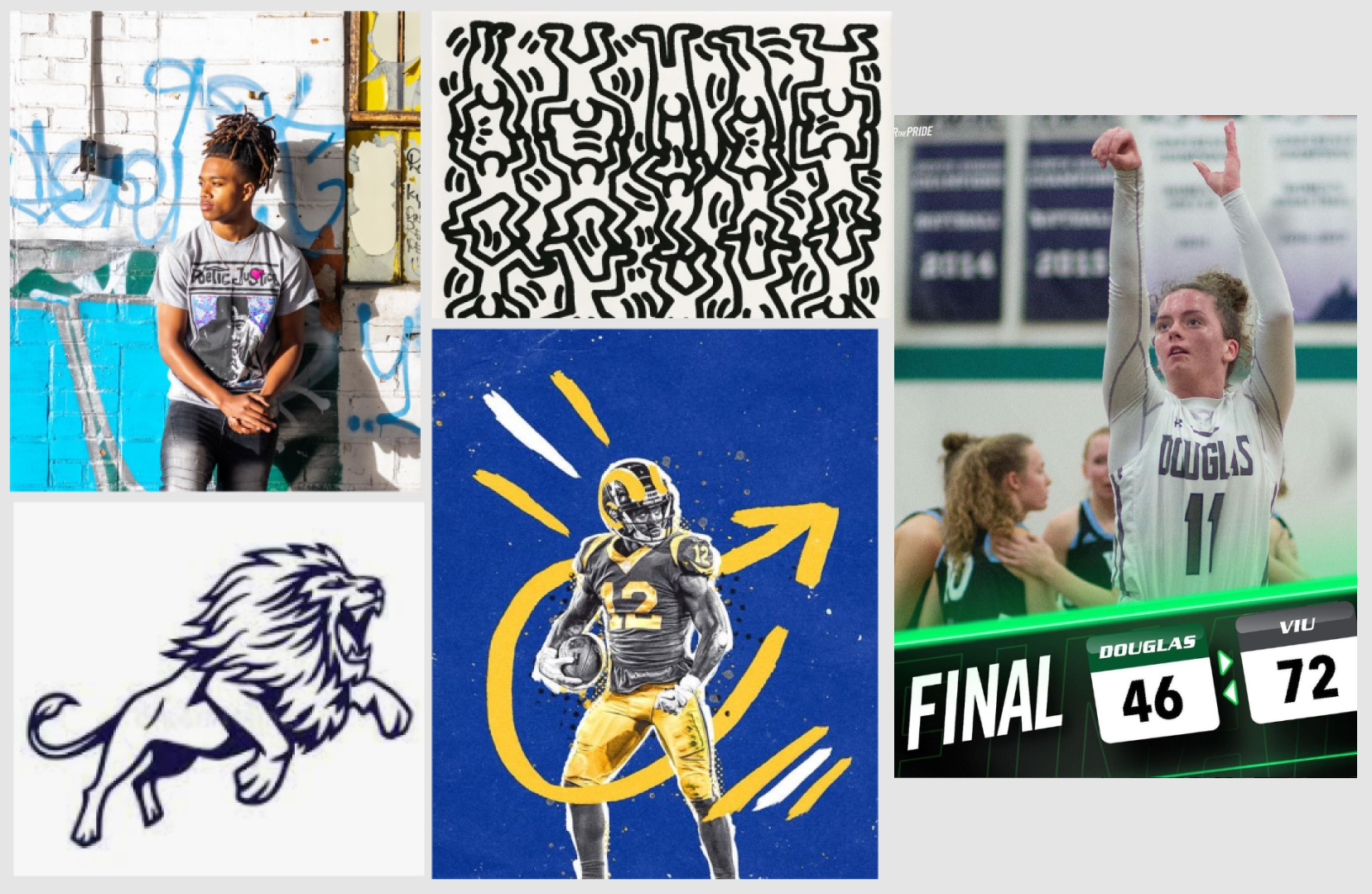
Combining the desired brand message for Royals and the new art directions, I redefined the design challenge of this project to:
How might we energize Royals' visual identity, while preserving recognition among existing fans, by incorporating an iconic pattern, dynamic angled elements, and urban textures?
Develop
Staying relevant to the brand
As an exploration of the first art direction, I created an initial pattern with lines, dots and primary shapes. However, I received feedback from my supervisor that the pattern was not expressive or unique enough to represent Royals as a brand. With guidance from my supervisor, I redesigned the pattern with letters and doodles of lions that were relevant to Royals' branding.

Exploring the combination of directions
I tested out the layout and use of textures after finalizing the design of the pattern. Torn paper, bricks, and paints are selected as the main texture for they communicate a sense of urban streets.
Brand awareness in another dimension
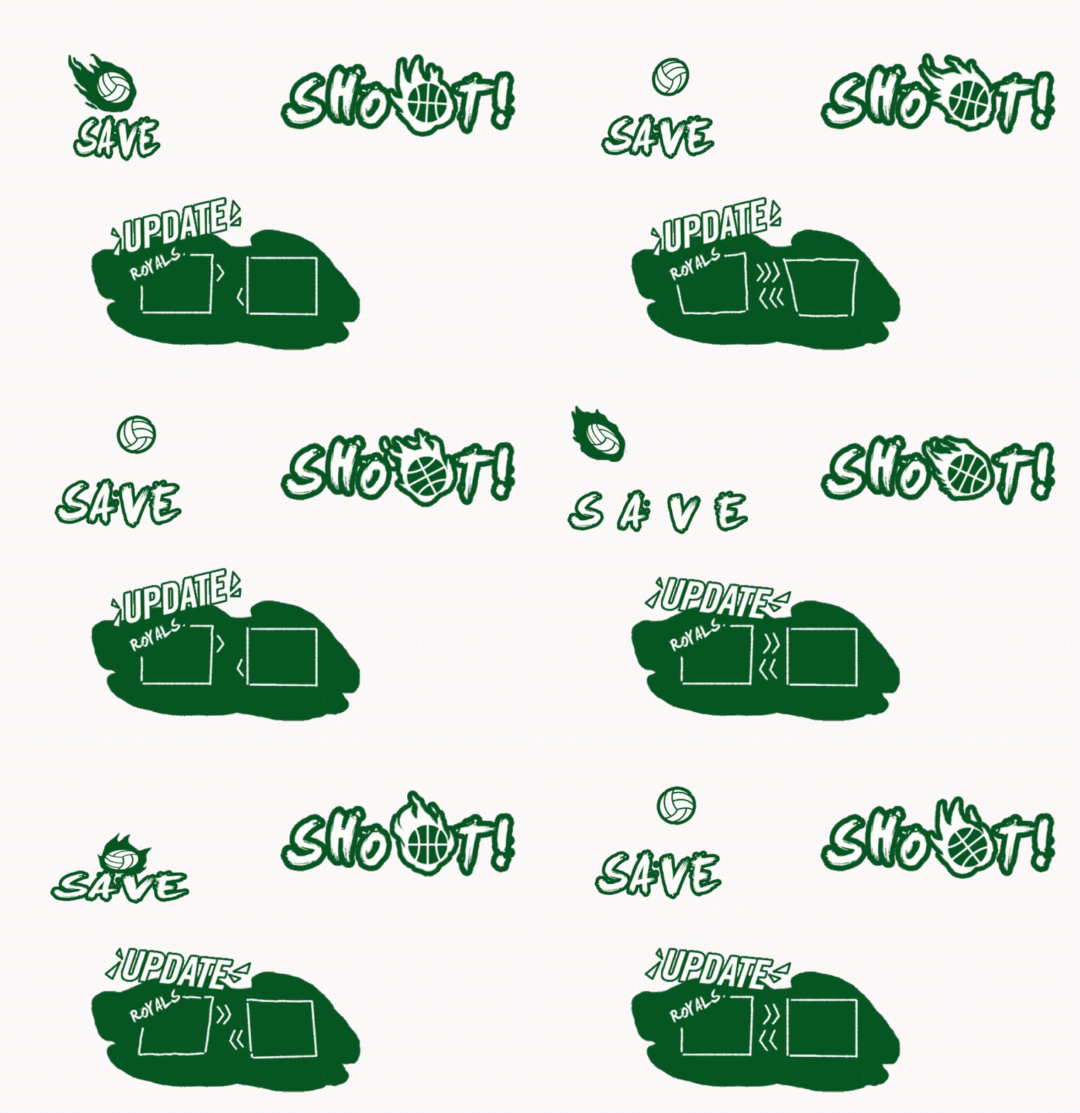
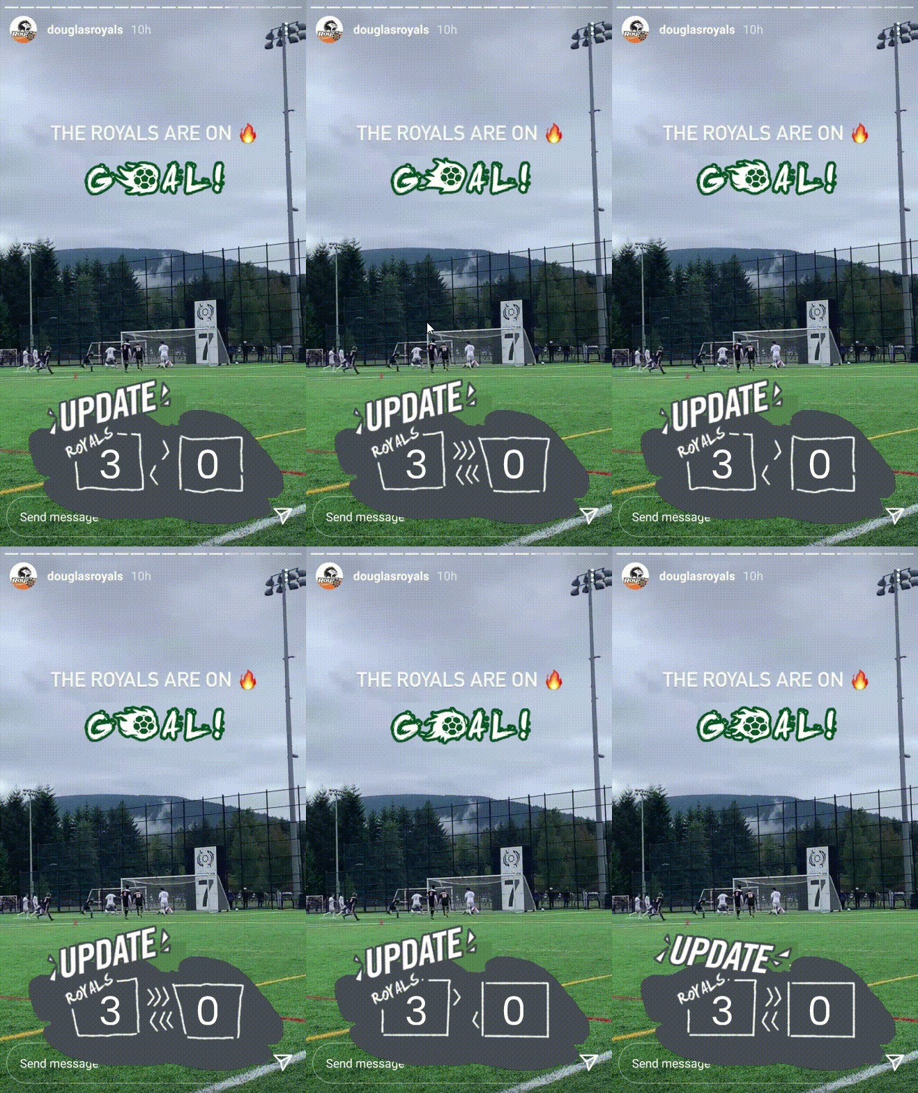
Inspired by my supervisor's discussion on brand experience on social media, I went beyond traditional branding assets and created a set of Instagram stickers for the new visual identity. These stickers are reusable and accessible to content creators who made game day coverage on spot. Since the Instagram Story coverage of games was a dominant touch point for fans to follow up with games, these stories got lots of exposure. Adding branded stickers to the content can maintain the consistency of visual identity and increase the brand awareness of Royals in an appealing way.
Deliver
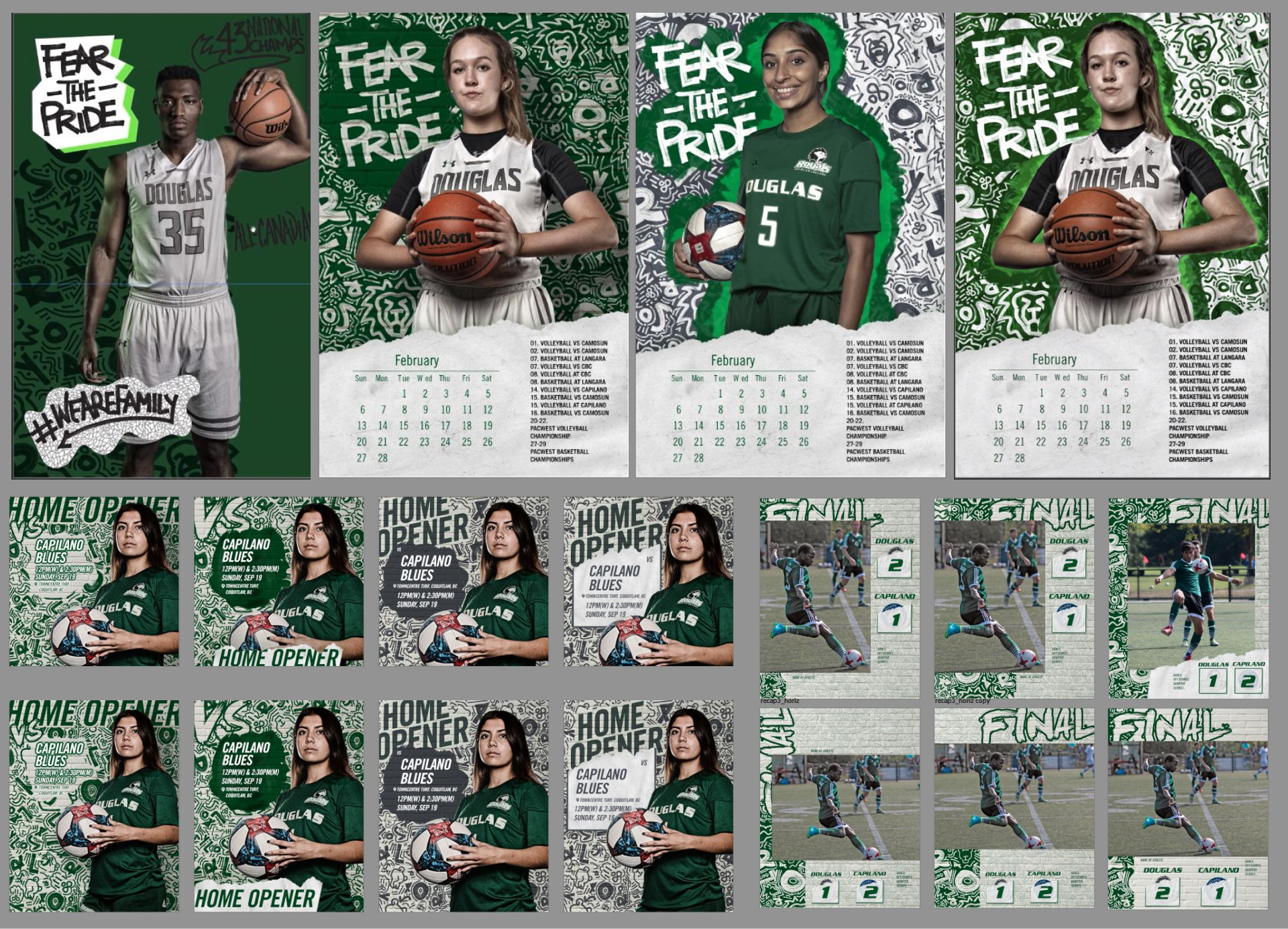
Application of Final Visual Identity
Application 1
Game Promotion and Recap Posts

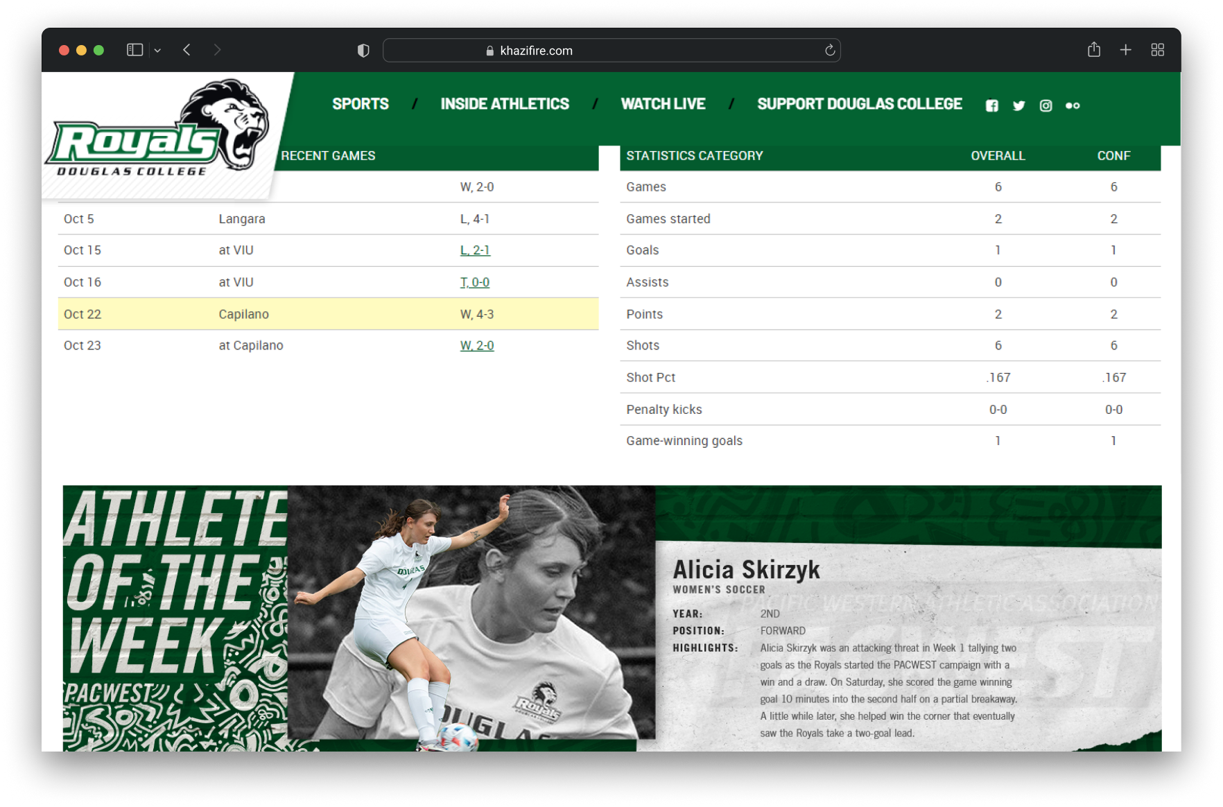
Application 2
Website Banners
Application 3
Instagram Story Stickers
Reflection
Branding is more than the look
Through the development of Royals' new visual identity, I realized that branding goes beyond just visual aesthetics. It encompasses the experience, emotions, and connections that a brand creates with its audience.
In the case of the Royals athletics team, the goal was not only to update their visual identity but to evoke new interests among the audience. By considering the brand's past, exploring new directions, and incorporating elements such as iconic patterns and urban textures, the visual identity was transformed.
Additionally, the inclusion of Instagram stickers as a branding asset boosted content engagement by 120% and received compliments from Communication Leads from other departments. This exemplified how encompassing various touchpoints and experiences in brand strategy can help to create a meaningful connection with the audience.
In my future practice, I'll apply insights from this project to shape users' recognition of my product.